
Weekly S&P 500 #ChartStorm - 25 Mar 2018
- Callum Thomas
- Mar 25, 2018
- 5 min read
Those that follow my personal account on Twitter will be familiar with my weekly S&P 500 #ChartStorm in which I pick out 10 charts on the S&P 500 to tweet. Typically I'll pick a couple of themes and hammer them home with the charts, but sometimes it's just a selection of charts that will add to your perspective and help inform your own view - whether its bearish, bullish, or something else!
The purpose of this note is to add some extra context beyond the 140 characters of Twitter. It's worth noting that the aim of the #ChartStorm isn't necessarily to arrive at a certain view but to highlight charts and themes worth paying attention to.
So here's the another S&P 500 #ChartStorm write-up!
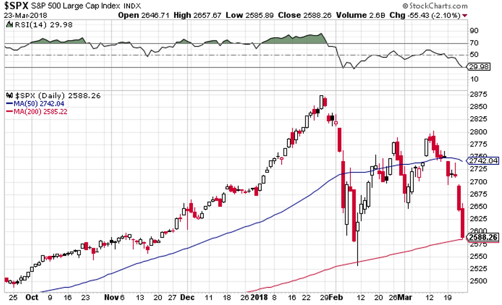
1. The Close: First up is a review of the past week's close, it was all going smoothly until the last two days of the week when the noise-flow pushed sentiment over the edge. Yet the S&P500 managed to close above its 200-day moving average. Maybe it's going to end up being a larger, slightly more complex W-shape!
Bottom line: The S&P500 closed above its 200-day moving average last week.
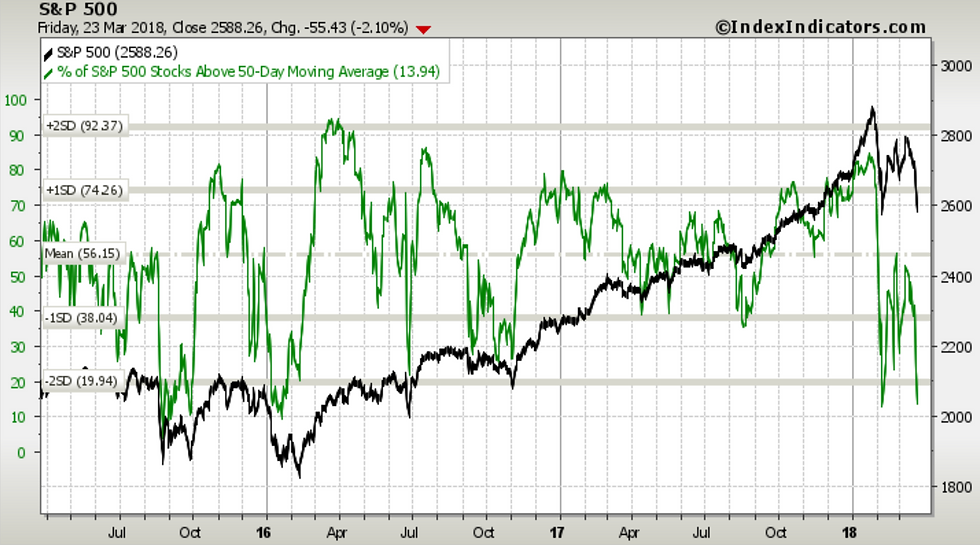
2. 50-Day Moving Average Breadth: Most will have noticed in the previous chart that the S&P500 closed below its 50-day moving average (has spent a few days below now), and looking at the chart of 50-day moving average breadth the participation is fairly broad-based as now fully 86% of S&P500 companies are trading below their 50-day moving average.
Bottom line: Seeing broad participation in the selloff across stocks.
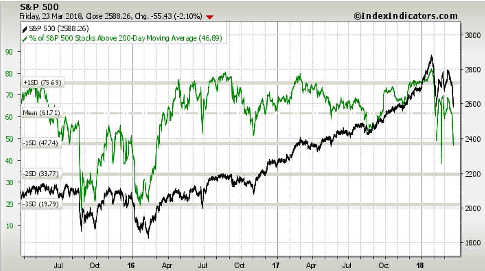
3. 200-Day Moving Average Breadth: Yet looking at the 200-day moving average breadth chart, it still hasn't probed the lows seen during the 2015/16 market turmoil. Of course students of democracy will be quick to point out that there are now 53% of stocks trading below their 200-day moving average: a slight majority. At this stage market breadth while indeed looking oversold, is best described as weak.
Bottom line: Market breadth looks weak.
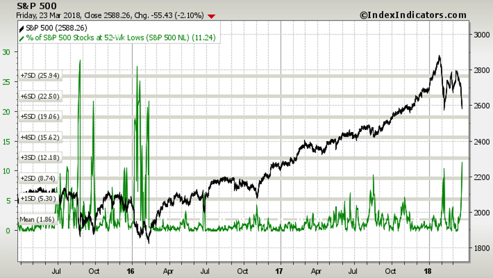
4. 52-Week New Lows: Last one on market breadth is a look at the proportion of stocks making new 52-week lows. This indicator has spiked as you might expect, and has exceeded the level reached in the first leg down, but remains quite below what we saw in 2015/16. It's tempting to look at this chart and proffer that the current stock market correction could have further to go.
Bottom line: Seeing a greater incidence of 52-week new lows.
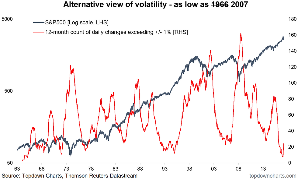
5. Alternative Volatility: The volatility regime has well and truly changed. This chart shows the running annual count of daily percent changes in the S&P500 which exceeded positive or negative 1%. This indicator has moved off of a 50 year low to now matching the level seen in 2007. This indicator most often rises during the topping process of a major market top, but it sometimes rises as the bull market moves into a more erratic phase e.g. the 1990's.
Bottom line: We have transitioned to a higher volatility regime.
6. The Euphoriameter: On a similar line, the Euphoriameter has made a sharp reversal after reaching the highest point since the dot com bubble. It has now reverted back to April 2017 levels, which represents a total unwinding of the tax-cut hype. The risk here is that this turn in sentiment becomes ingrained and self-reinforcing. Indeed this indicator has turned down like this during the process of putting in a major top so it's not one to dismiss.
Bottom line: A big reversal in sentiment has taken place.

7. The Monday After: This interesting table shows some statistics which provide a historical view of what happened on the next trading day following a bad close on Friday. With Friday's close being a -2% day it puts it in the last column, and interestingly enough the results are about 50/50 (positive or negative on the Monday), albeit the average return is not pretty. Interestingly enough the subsequent 5-day return is not too bad.
Bottom line: It's 50/50 as to what will happen on Monday.

8. What Type of Correction: This chart, slightly out of date by a few days, shows the average path of markets following a 10% correction during the average bull and bear market. With Friday's close at similar levels to the initial leg down it looks at this stage to be more fitting with the start of a bear market, judging solely by this chart. So it's another cautionary.
Bottom line: The correction appears to be behaving more like the start of a bear market.

9. Zombie Companies: This interesting graph provides a glimpse at a possible "zombie apocalypse" especially if bond yields and interest rates were to rise significantly from here. Basically it shows the proportion of Russell 3000 stocks which had interest expense which either matched or exceeded their EBITDA. I would note however that this almost looks like a contrarian indicator, as the biggest movement in this indicator will come from a recession (reduction in EBITDA) than a surge in rates - which would probably be accompanied by better economics (and hence supportive to sales/earnings growth) anyway.
Bottom line: The proportion of "zombie companies" has risen to 16%.

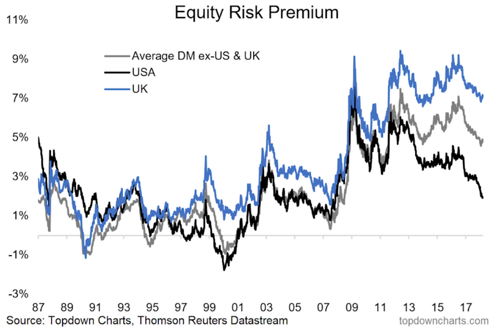
10. Equity Risk Premium: The final chart shows the equity risk premium across the major developed markets. Aside from the relative value case favoring ex-US, it's interesting to note how significant the squeeze in the US equity risk premium has been. It may not be as low as it got during the 2000 and 2007 tops, but it certainly has come down a lot since the high point in March 2009. The US equity risk premium has been squeezed on both ends by higher PE ratios and higher bond yields.
Bottom line: The US equity risk premium has tightened up a lot recently.
So where does all this leave us?
This week there's probably 2 main themes
1. Deteriorating Breadth
On the breadth front we saw how on 50-day moving average breadth metrics there has been fairly broad participation in the correction, while a slim majority on 200-day moving average breadth have broken down, and a higher level was struck on 52-week new lows.
2. Bearmarket Warning Signs
The chart showing the average path of a 10% correction against the average start of a bear market (vs average correction within a bull market) is a little bit concerning, likewise the sharp turnaround in the Euphoriameter and the turn up from extreme lows in the volatility indicator.
Summary
Based solely on the set of charts in this week's edition of the weekly S&P500 Chart Storm, you would probably be tempted to become a bit more bearish at the margin. Indeed a number of indicators are behaving similar to what you might see during a major market topping process aka the start of a bear market. However the other interpretation is that it's simply looking oversold and undergoing a reset in extreme bullish sentiment, against a still solid fundamental/earnings backdrop. I am reluctant to make a bold call either way at this point, and will defer to the charts as the coming days and weeks shed more light on the outlook.
See also: Weekly S&P500 #ChartStorm - 18 Mar 2018
Follow us on:


Comments