
Weekly S&P 500 #ChartStorm - 27 May 2018
- Callum Thomas
- May 27, 2018
- 6 min read
Those that follow my personal account on Twitter will be familiar with my weekly S&P 500 #ChartStorm in which I pick out 10 charts on the S&P 500 to tweet. Typically I'll pick a couple of themes and hammer them home with the charts, but sometimes it's just a selection of charts that will add to your perspective and help inform your own view - whether its bearish, bullish, or something else!
The purpose of this note is to add some extra context beyond the 140 characters of Twitter. It's worth noting that the aim of the #ChartStorm isn't necessarily to arrive at a certain view but to highlight charts and themes worth paying attention to.
So here's the another S&P 500 #ChartStorm write-up!
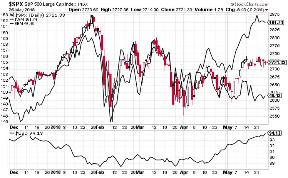
1. Macro Winners/Losers from a Stronger US Dollar: First up is what's up and down and up... and in between. That is, basically the winners (e.g. US small caps), and losers (e.g. emerging market equities) from a stronger US dollar, and the apparent indecision that is creating for the S&P500 index, caught in between these crosscurrents. My view is the strength in the US dollar we have seen so far is enough to definitely create some winners and losers like we have seen, but if it goes further it will create more losers than winners, particularly when you pair it with Fed QT and rate hikes. So for me a big macro driver for risk (and opportunity!) is going to be the US dollar - watch this space.
Bottom line: The stronger US dollar is creating winners and losers.
2. Market Breadth by Sector: On the topic of winners and losers, this interesting display of market breadth by sectors, from Bespoke Investment Group shows another lens. It's an interesting chart because it's a mixed picture. 2 of the top 5 sectors are defensives, and 2 are just commodities (which in my view, tactically are on borrowed time), and certainly at the bottom end the worst 2 are indeed defensives (although you could argue staples are beset by structural issues e.g. e-commerce, and utilities are just fallout from the bond selloff), meanwhile the core cyclicals (discretionaries and industrials) are middle of the road. So it's hard to say something like the strong sectors are cyclicals so it's bullish, but I guess you can say that the stronger sectors are consistent with the reflation theme... which may get a hit if you get a stronger dollar (as mentioned in the previous chart). So the conclusion is that it's a mixed picture.
Bottom line: Market breadth by sector presents a mixed picture.

3. Revenue Growth by Sector: Staying with the sector view, it's all winners on revenue growth. As FactSet shows, deadline revenue growth for the S&P500 was 8.5% in Q1, which is a solid pace. The standouts at the top end are again, the commodity sectors, with Tech still also going very strong. Revenue growth overall is getting a boost from the weakening of the US dollar *last year*, the rebound in commodities, and the solid domestic economy.
Bottom line: Revenue growth looks solid across sectors.

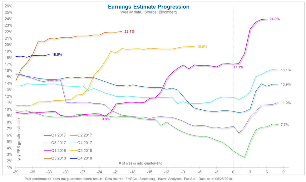
4. Earnings Estimates Through Time: Staying with the topic of revenue and earnings, this chart from Jurrien Timmer of Fidelity Investments shows the progression of consensus earnings estimates across time. The most poignant observation from this is that earnings growth is expected to run at around 20% over the next few quarters. A big driver on the earnings side (as distinct from revenue) is obviously the tax cuts.
Bottom line: Analysts are picking ~20% earnings growth for the next few quarters.
5. Earnings Growth Statistics: The next table from HORAN Capital Advisors shows (courtesy of Thomson Reuters) how revenue, net income, and earnings are expected to progress over the next couple of years. Notably, in juxtaposition with the previous chart, the magic of "base effects" will drive earnings growth down to the lowest pace in 10 quarters in Q1 of 2019 (holding everything constant -- it could turn out to be better or worse). So it's a case of the Trump (tax cuts) Bump in earnings growth just for this year.
Bottom line: Forward earnings growth tapers off to a more average pace next year.

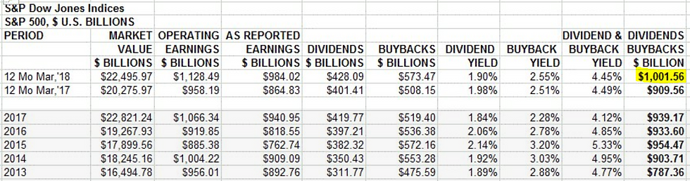
6. Dividends and Buybacks: On earnings and tables and statistics, this one from Howard SIlverblatt of S&P Dow Jones shows a remarkable milestone. The sum of dividends + buybacks in the 12 months to March 2018 reached (over) US$1 Trillion Dollars for the first time ever. As an interesting side note, check out how the dividend + buyback yield is 4.45% vs the dividend only yield of 1.9%. Buybacks are set to get a boost this year from the previously mentioned tax cuts and reforms.
Bottom line: Dividends + buybacks reached a record high in the 12-months to March 2018.
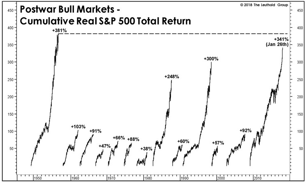
7. The Greatest Bull Markets: And on the topic of records, this chart from The Leuthold Group shows the best post-war bull markets in real total return terms. The 1949-56 bull market was the GOAT (Greatest Of All Time), and for the current bull market to break that record the S&P500 would have to get above 3000 (without going into a bear market before hand!). I would say that there are plausible scenarios where this could happen, we're late cycle for sure, but not quite end of cycle yet...
Bottom line: The S&P500 would need to go to 3000+ to create a new GOAT bull market.
8. Time in the Market: On a similar line of inquiry, the next chart from Michael Lebowitz of Real Investment Advice shows the S&P500 in real terms (inflation adjusted) since 1900. In particular he shows the time taken for the S&P500 in real terms to reclaim previous tops... it brings to mind old platitudes like "markets don't go up in a straight line", and hits home hard on the truism that you get what you pay for, or that the price you pay matters. That is, time in the market can be feast or famine.
Bottom line: Time in the market can be feast or famine.

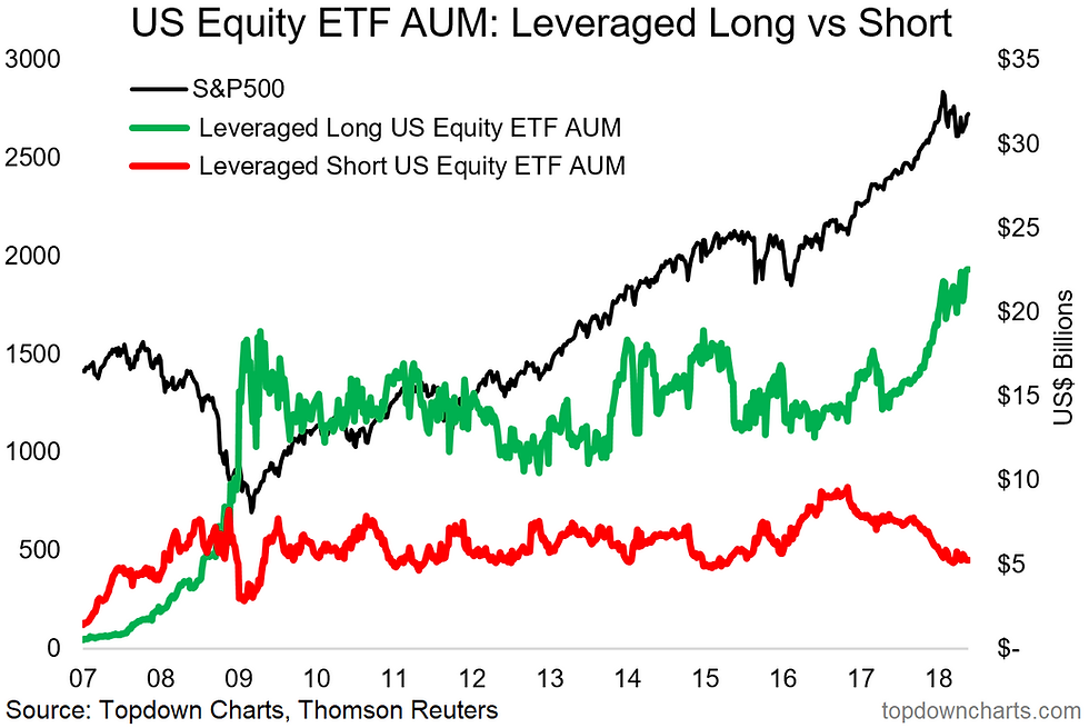
9. Leveraged Long US Equity ETF AUM: Back on the topic of records, last week saw a new record high in leveraged long US equity ETF assets under management. At the same time leveraged short ETF assets remain around the 2015 levels, so you can see investors are voting with their feet here in terms of how confident they are. Looking at the brief history of the series there doesn't seem to be a signal, from this but it certainly is interesting background context. Can't help but wonder what might happen to this growing segment of the market if it gets put to the test like the short-volatility ETFs did. That's a matter for another time.
Bottom line: Leveraged long US equity ETF AUM reached an all time high.
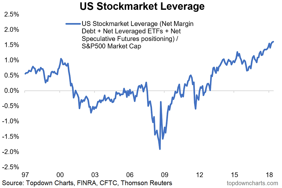
10. Total Stockmarket Leverage: Final one is an aggregated view of US stock market net-leverage. Similarly, this one is also at a record high - and that's after standardizing it against S&P500 market cap. This indicator combines net margin debt from FINRA, speculative futures positioning from the CFTC, and net-leveraged ETF AUM from Topdown Charts. In absolute terms it's close to US$400 billion. Again, it's a signal which like expensive valuations can make being long uncomfortable, but the time lag between seeing a record high in an indicator like this and an eventual round of market indigestion or a bear market can be quite long (or short). It's an important background feature to be mindful of and it's fair to say that with such leverage comes greater risk of a selling cascade in the event of rapid liquidation/margin calls.
Bottom line: Overall stock market leverage is at a record high.
So where does all this leave us?
This week there's probably 3 categories...
1. Macro Winners and Losers
On the macro winners and losers, the US dollar is driving strength in small caps and weakness in emerging market equities, and indecision for the S&P500. As we saw with market breadth by sector there's also reflation winners and losers (staples and utilities vs energy and materials).
2. Earnings and Reporting
On earnings and reporting we saw the outlook for solid earnings growth this year ...which may give way to less impressive growth rates in 2019 thanks to base effects. We also saw the solid revenue growth numbers across sectors, and a new record high in dividends + buybacks.
3. Record Highs
Aside from the record in dividends + buybacks, we also looked at previous records for S&P500 bull markets, and the record highs in leveraged bets on the US equity market.
Summary
This week it was an interesting mix of macro, earnings, and records and perspective. The macro winners and losers aspect is pretty important because it highlights some of the key risks and opportunities for the outlook from here. The earnings aspect serves as a reminder of some of the very important trends underway under the surfaces. And the records and longer term charts help provide some important context and perspective. We all know it's late cycle, but what we don't know is when that cycle ends, so keep watching the charts!
See also: Weekly S&P500 #ChartStorm - 20 May 2018
Follow us on:


Comments