
Weekly S&P 500 #ChartStorm - 5 Aug 2018
- Callum Thomas
- Aug 5, 2018
- 5 min read
Those that follow my personal account on Twitter will be familiar with my weekly S&P 500 #ChartStorm in which I pick out 10 charts on the S&P 500 to tweet. Typically I'll pick a couple of themes and hammer them home with the charts, but sometimes it's just a selection of charts that will add to your perspective and help inform your own view - whether its bearish, bullish, or something else!
The purpose of this note is to add some extra context beyond the 140 characters of Twitter. It's worth noting that the aim of the #ChartStorm isn't necessarily to arrive at a certain view but to highlight charts and themes worth paying attention to.
So here's the another S&P 500 #ChartStorm write-up!
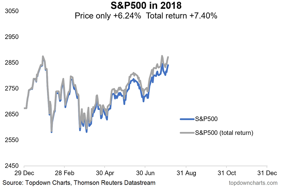
1. S&P500 Total Return Chart: First up is a quick look at the S&P500 in total return terms (i.e. incorporating dividends), the notable point here is that on the 25th of July in total return terms the S&P500 actually made a fresh new high for the year. More an interesting observation than earth shattering insight.
Bottom line: Accounting for dividends, the S&P500 in total return terms has already made a new high this year.
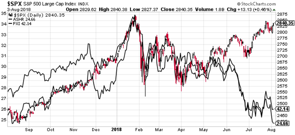
2. S&P500 vs Chinese Stocks: Seems like some people are talking about this chart as a harbinger for US stocks (that it is a gap that needs to close). I would say it's a logical reflection of the underlying macro currents. China's economy is cooling due to peaking property price growth, a rolling over of export growth, and the delayed flow through of previous policy tightening. Compare this to America where earnings are accelerating, and economic growth numbers are running hot. What I would note though is that the PBOC is in easing mode, vs the Fed in tightening mode, and Chinese stocks are cheap vs expensive US stocks. So it's a divergence in price which reflects an underlying macro divergence. Will the gap close? We'll see.
Bottom line: Chinese stocks are diverging vs US stocks due to divergent macro currents.
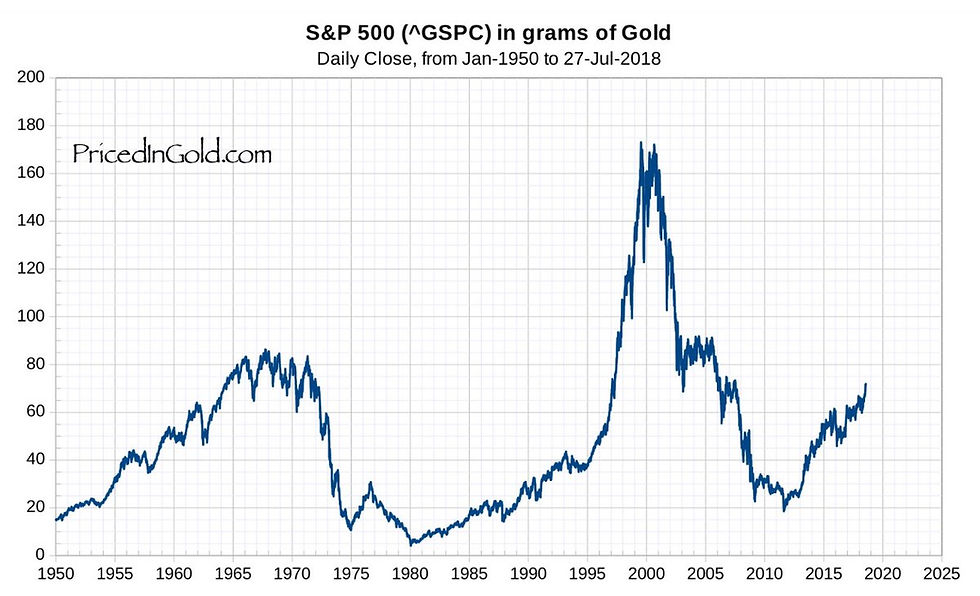
3. S&P500 Priced in Gold: I thought this chart was really interesting because of the apparent long term cycles. It shows the S&P500 priced in gold (so if it's going up it basically means equities are outperforming gold. What I find most interesting is how extreme and extended some of the historical moves have been, so the key conclusion in my view is that there's no telling how far the current move will go.
Bottom line: The S&P500 is outperforming vs gold, and this may continue.
4. US Buyback Seasonality: There has been a lot of talk about corporate buybacks, some people lament it as a distorting force, others just write it off as a background feature. Whichever camp you fall in, you can't deny the flow-power of buybacks, and interestingly enough the average tendency is for buyback activity to spike in August, with an average 13% of total buybacks for the year taking place this month. All else equal this should be a bullish tailwind.
Bottom line: Buybacks tend to be slightly more concentrated in the month of August.

5. US Earnings Surprise Indicator: As earnings season heats up, it's worth noting how strongly positive earnings surprises have been. This chart from Nordea Markets shows the extent of earnings surprises - the strongest since 2009. All else equal this is a bullish tailwind from a fundamental perspective.
Bottom line: Positive earnings surprises are running hot.

6. S&P500 Earnings Beats: This chart from Bloomberg shows a similar metric. Aside from the recent surge, what's also interesting is the apparent structural trend toward more consistent upside surprises. It probably speaks to the gaming of earnings estimates by companies, where the aim of the game is to guide earnings positive enough to support the stock price, but to downplay it enough so that they end up beating to the upside when the results are finally released. Even accounting for the uptrend, the latest readings are strong indeed.
Bottom line: Corporate earnings surprises are at a cyclical and structural high.

7. Bitcoin Diversification: A bit of a fun chart, with the benefit of hindsight, investors who added a small allocation to Bitcoin would have enjoyed outsized benefits to their overall portfolio returns. Of course this is only clear in hindsight, and the future of Bitcoin truly is anyone's guess. As they say, it's easy to feel like a genius when prices are going up... the return experience since the peak of course would also be very different vs the "long run".
Bottom line: A small allocation to Bitcoin would have had an outsized impact on portfolio returns.

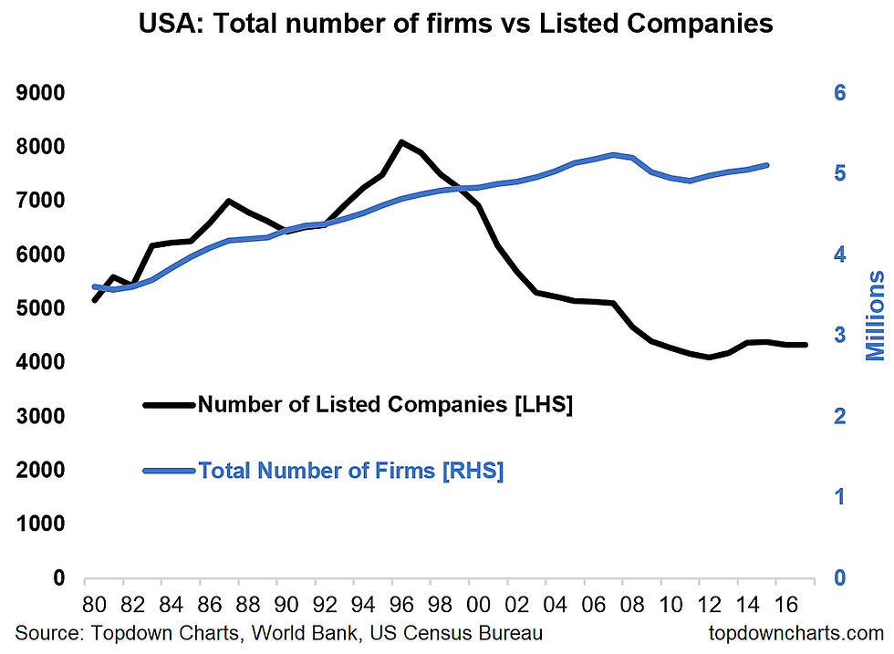
8. US Listed Companies vs Private Companies: This chart shows the disconnect between the trend in the total number of firms in America vs the total number of listed companies. It speaks to a number of key themes such as excessive regulations which disincentivized people to take companies public, as well as the rise of private equity, and ongoing M&A activity. This chart becomes particularly interesting when you look at it alongside the next chart...
Bottom line: The growth of listed companies has not matched the growth in the total number of firms.
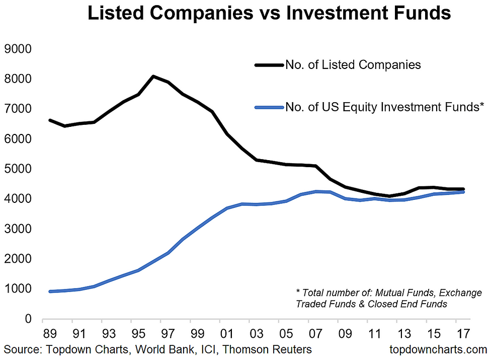
9. Listed Companies vs Investment Funds: Speaking of the number of listed companies, this chart shows an interesting phenomenon where the number of available funds for US equities has basically matched the number of listed companies. Makes one wonder if there has been a shift in preference by investors to invest in funds rather than individual securities. Certainly food for thought.
Bottom line: The number of ways to invest in stocks has matched the actual number of stocks.
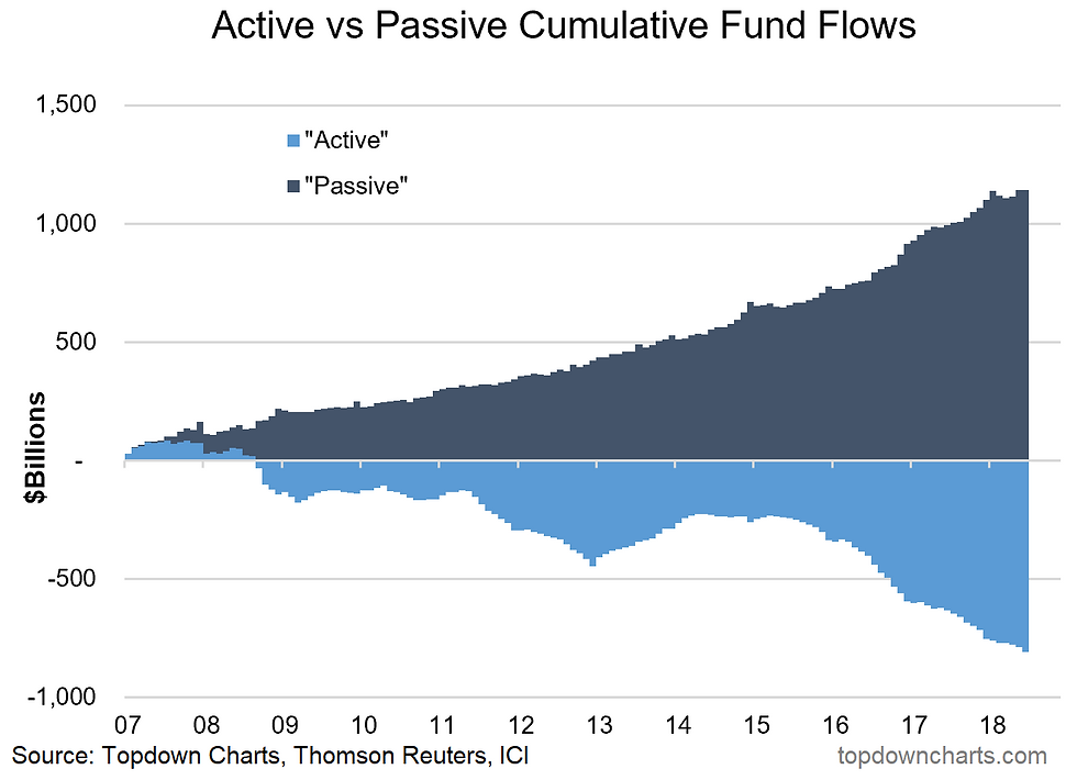
10. Active vs Passive Fund Flows: The final chart shows the flows for active vs passive funds, and was included in honor of Fidelity's new zero-fee fund. Fidelity announced last week it would be dropping fees to 0% for two new index funds it would be launching. This marks the climax in the race to zero for passive funds, and is a logical conclusion given the often minimal costs involved in running a passive fund, and the benefits to Fidelity's broader business. Anyway, aside from the industry implications, it's good news for investors as fees can be damaging to long term returns if they aren't backed by superior returns.
Bottom line: Flows to passive funds have been relentless as costs come down.
So where does all this leave us?
This week there were 2 main themes:
1. Bullish tailwinds
As the market makes new highs on a total return basis, a couple of tailwinds are in play; strongly positive earnings surprises and a seasonal uptick in buyback activity. There's also the point that the S&P500 vs gold ratio can run further and faster than you might expect.
2. Structural changes
On structural changes there's the steady decline in listed companies and the steady rise in ways to invest in these companies. These have coincided with the rise and rise of passive investing, which has also come with the fall and fall of fees - now with zero fee passive funds on the market.
Summary
This week we got a reminder of a couple of important themes with the usual mix of charts. The first theme, on a longer term perspective, is the rise of passive investing, fall in fees (to zero), and the decline of listed companies. It goes to show the constantly changing investment landscape. On a shorter term basis, the surge in positive earnings surprises and the impending flurry of buybacks speaks to the short-term forces shaping the market. Though risks are elevated, valuations lofty, and business cycle maturing, it seems the path of least resistance for the S&P500 is higher. I could be wrong, but let's keep an eye on the charts for our next clue in this ever changing puzzle.
See previous write up: Weekly S&P500 #ChartStorm - 1 July 2018
Follow us on:


Comments