
Weekly S&P 500 #ChartStorm - 19 Aug 2018
- Callum Thomas
- Aug 19, 2018
- 5 min read
Those that follow my personal account on Twitter will be familiar with my weekly S&P 500 #ChartStorm in which I pick out 10 charts on the S&P 500 to tweet. Typically I'll pick a couple of themes and hammer them home with the charts, but sometimes it's just a selection of charts that will add to your perspective and help inform your own view - whether its bearish, bullish, or something else!
The purpose of this note is to add some extra context beyond the 140 characters of Twitter. It's worth noting that the aim of the #ChartStorm isn't necessarily to arrive at a certain view but to highlight charts and themes worth paying attention to.
So here's the another S&P 500 #ChartStorm write-up!
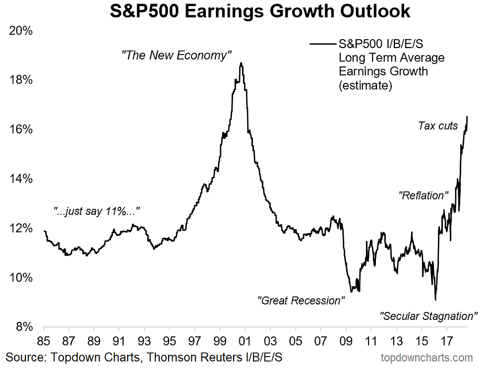
1. S&P500 Long Term Earnings Growth Estimates: First up is a look at a peculiar yet astonishing indicator, the Thomson Reuters IBES consensus estimate of long term earnings growth for the S&P500. The main point here is that it's at the highest level since the dot com boom. Back then it was euphoria about the new economy, now it's the tax cut extension from the previous reflation turnaround. I would say it shows a certain element of euphoria on the earnings outlook, and the question is how long this higher level of expected growth can hold up? (and how much higher can it get from here?).
Bottom line: Long term earnings growth estimates are at the highest point since the dot com bubble.
2. S&P500 Operating Margins: On a similar line, the next chart by Charlie Bilello of Pension Partners shows S&P500 operating margins at a record high. This is a powerful chart. It's bullish for the obvious reasons (and bullish for capex growth - something I've talked about a lot). But again, there's the question - can it get much higher from here?
Bottom line: S&P500 operating margins are at a record high.

3. Most Favorable Profit Outlook: This chart, shared by Cam Hui of Humble Student, shows one of the really interesting trends observed in the latest BAML fund manager survey. It shows fund managers now overwhelmingly expect the best profit outlook in America. This says a lot about the capitulation we've seen on the relative value trade as investors give up on cheap valuations in emerging markets and buy expensive US stocks, opting for the "cleanest dirty shirt".
Bottom line: Global fund managers expect the best profit performance in America.

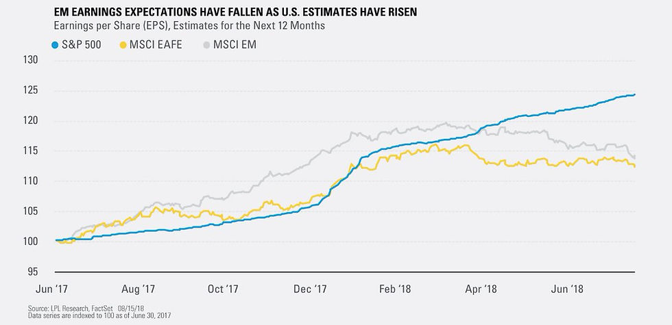
4. Forward Earnings - US vs Global: Another angle on the same issue, this chart from Ryan Detrick of LPL Research shows the progression of forward earnings for the USA vs the MSCI EAFE (Europe, Australasia, and Far East), and MSCI EM (emerging markets). Basically we're seeing divergence as US forward earnings estimates go from strength to strength whereas EM has been deteriorating and EAFE basically going sideways. Again it's this divergence in earnings prospects which is driving the relative value capitulation (more on that in the next chart), not to mention the stronger US dollar... it's all interconnected!
Bottom line: US forward earnings are improving vs lackluster growth in global ex-US.
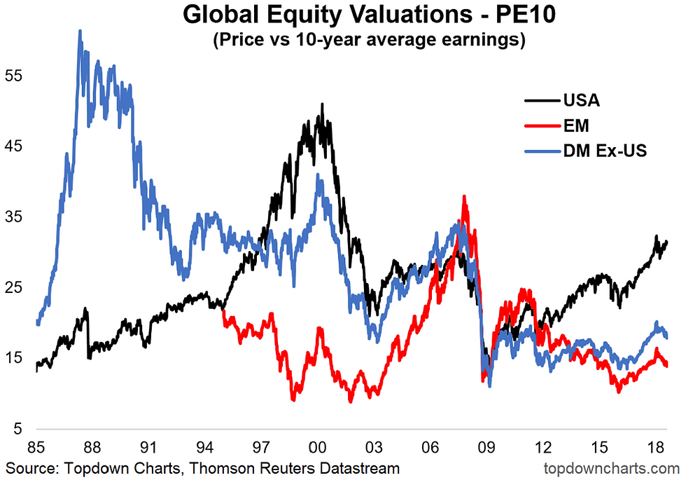
5. Global Equity Valuations: As noted, and as I've previously talked about, global equity valuations show a picture of expensive stocks in America and cheap stocks basically everywhere else. Emerging markets are still on the bottom rung of the ladder, trading at a substantial discount to US and a material discount to DM ex-USA. If you could ride out the volatility the thing to do would be to buy the cheaper stuff as valuations tend to speak for themselves in the longer run. For now short term headwinds dominate, so who knows, maybe cheaper valuations are yet to come!
Bottom line: US equities still look relatively expensive compared to EM and DM ex-US.
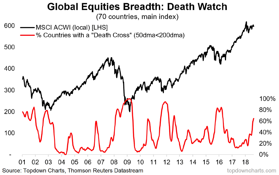
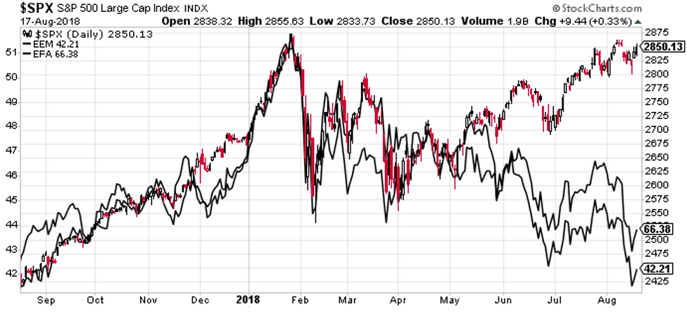
6. Global Equity Death Watch Breadth: On the topic of global equities and the USA, the S&P500 is one of relatively few markets yet to put in a death cross (50 day moving average falling below the 200 day moving average). A big driver of this weak global equity picture is frontier and emerging markets, with Fed tightening and a stronger US dollar putting the pressure on and adding to that wave of relative value capitulation I mentioned earlier.
Bottom line: All is not well in global equities.
7. S&P500 vs EAFE and EM Equities: And to really hammer it home, this chart shows EAFE and EM equities against the S&P500 and you can see the big performance gap opening up... and let's face it, a lot of the time price and past performance have a heavy impact on investor psychology and can end up driving feedback loops like the ones we've seen starting to rear their heads in emerging markets. One thing is true with this chart: the way this gap closes (or doesn't) will likely throw a lot of people off...
Bottom line: There's a material performance gap between US and global equities.
8. Insider Sales: This next chart provides an insight into the trends in insider buying/selling activity. It shows insider sales are surging. Basically insiders are getting theirs while the getting's good. Whether this is a seasonal surge or something sinister remains to be seen, but there it is.
Bottom line: Insider selling activity is picking up.

9. Tech Fund Flows: A good lead in to the last chart, this one shows tech fund flows, and the suggestion is that after surging for the last couple of years, tech flows look to be rolling over. This is really important, because technology stocks (and cyclicals more broadly) have been driving much of the strength in the bull market over the last couple of years, so if the bottom falls out of this corner of the market it will be pretty decisive for the rest of the market too.
Bottom line: Tech stock fund flows look to be rolling over.

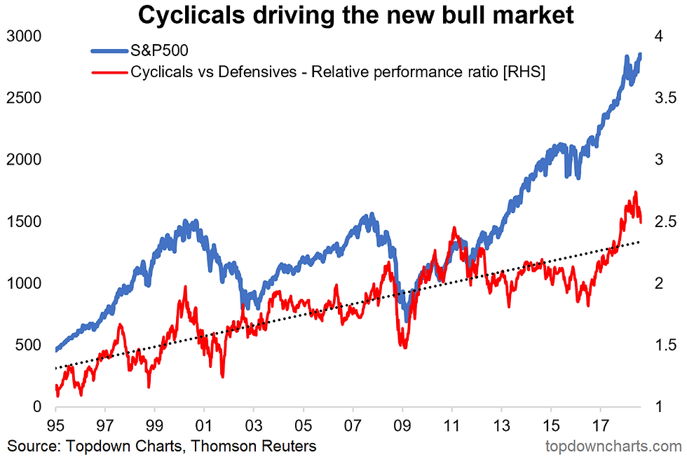
10. US Cyclicals vs Defensives: Final chart is one of my own and one that I think is probably going to end up being the most important chart of the year for the S&P500. Now there's two ways that red line can unwind (i.e. the extreme relative performance we've seen in cyclicals vs defensives): a bullish rotation where defensives take the lead, or a bearish rotation where cyclicals drive a selloff or perform relatively worse in the even of a correction or bear market. The fact that it's already rolled over means the market is on notice at this point. Ignore this one at your peril.
Bottom line: Cyclicals vs defensives is a key potential vulnerability for the market.
So where does all this leave us?
This week there's probably 3 main themes...
1. S&P500 earnings
The charts showed just how compelling US earnings growth has been with long term consensus estimates at euphoric levels, operating margins at record highs, and an interesting divergence between forward earnings in America vs the rest of the world.
2. Global equities
On that earnings outlook divergence, there has been an apparent capitulation in the relative value trade (cheap global stocks vs expensive US stocks) as investors favor the superior earnings picture and flee growing stress in frontier and emerging markets.
3. Cyclicals vs Defensives
There are some clues of a possible rotation or unwinding of the extreme relative performance seen in cyclicals vs defensives, and this is a key potential vulnerability for the S&P500.
Summary
So to bring together a sort of unifying view based on the charts this week, we have a picture of solid earnings growth in America, particularly so vs global, and for now US equities are avoiding the stress that seems to be befalling the rest of the world. If this divergence continues it's likely that sooner or later the US will start to feel the flow on effects. Placing this against the apparent rollover in tech flows and cyclicals relative performance it feels like the short term risk-reward outlook is going to be strained. Long term investors will probably want to take a break for a while, for everyone else it's time to shorten up horizons as we get into the later stages of the cycle.
See also: Weekly S&P500 #ChartStorm - 12 Aug 2018
Follow us on:


Comments