
Weekly S&P 500 #ChartStorm - 21 April 2019
- Callum Thomas
- Apr 22, 2019
- 9 min read
Those that follow my personal account on Twitter will be familiar with my weekly S&P 500 #ChartStorm in which I pick out 10 charts on the S&P 500 to tweet. Typically I'll pick a couple of themes to explore with the charts, but sometimes it's just a selection of charts that will add to your perspective and help inform your own view - whether its bearish, bullish, or something else!
The purpose of this note is to add some extra context and color. It's worth noting that the aim of the #ChartStorm isn't necessarily to arrive at a certain view but to highlight charts and themes worth paying attention to.
So here's another S&P 500 #ChartStorm write-up!
1. US Cyclicals vs Defensives and the Echo Bull Market: First up is a really interesting chart which has drawn out a bunch of both bullish and bearish comments. But basically my take on this is that there is a distinct possibility that the rally we are seeing in cyclicals vs defensives relative performance is a sort of "Echo Bull Market" - in many ways similar to the new bull market of 2016-18, which was primarily driven by cyclicals.
The obvious bullish implication is that we may see another year or two of gains as the echo-bull runs its course. The bearish take though is that it's a 'fake rally' in cyclicals, which is not matched by improvement in the types of factors which drive cyclicals vs defensives (i.e. improving risk appetite and an improvement in the economic pulse). In that case the market is purely running on fumes and downside risk is elevated. My base case is the former.
So I think it's one worth paying particular attention to, especially as the divide between bulls and bears seems to have deepened in recent weeks.
Bottom line: The strength in cyclicals may drive a new "echo bull market".

2. Global Cyclicals vs Defensives - Synchronized Uptick: Taking a global perspective, the next chart shows the same type of analysis, looking at cyclicals vs defensives across the major regions/countries of global equities. The standout feature in this chart is how across all geographies, there has been a synchronized upturn over the last couple of weeks.
This chart was a key reason I advised caution last year given that cyclicals vs defensives rolled over across the globe, but of particular note was emerging markets, which was the first to rollover and the first to recover (which again was very useful in timing EM equities in particular). My point is, just as weakening performance here was a red-flag for risk, I think the strength we're seeing here is the closest thing to a green light for equities that you can get. Especially given some of the economic green shoots...
Bottom line: Cyclicals vs defensives have perked up across the globe, which is a positive sign.

3. Equity Market Performance after Green Shoots: Speaking of "green shoots", Martin Enlund of Nordea Markets shows an interesting chart here which maps out how equity markets performed following a period where there were an increasing number of stories mentioning economic green shoots. It looks like there may be some upside left, but then on average performance tapers off (I guess this makes sense as markets are quick to price in expected improvement -- remember: markets are forward looking, not backwards looking).
As a side note, some have murmured that we shouldn't even be talking about green shoots as the last time we really talked about green shoots was in 2009, following a major global economic recession and financial crisis. But if you look at the performance across global markets in 2018, yes it wasn't the same scale as 2008, but there were some very substantial drawdowns in risk assets, and if you look at the hard data it has all the hallmarks of a potential global recession... so I think it is fine to call it green shoots. But then again, my base case has been that we are looking at a passing growth scare and not a prolonged/deep global recession. Just my opinion...
Bottom line: Equities tend to see a little bit more upside after everyone starts talking about so-called economic "green shoots".

4. Dumb Money Confidence: This next one is quite an interesting one, perhaps a little controversial even, and comes from the ever-insightful and excellent Sentimentrader. The main point is that their composite view of "dumb money" sentiment has reached a decade-high. When sentiment becomes very stretched it often spells the end of a move, or certainly at least a bit more volatile trading.
The concept of dumb vs smart money is a tad controversial, basically the idea is that dumb money = retail punters, who tend to get on/off at the precisely the wrong time as the theory goes they are driven more by fear and greed and tend to be less well-resourced and less-informed. In all fairness I have seen plenty examples of very smart retail investors, and very dumb institutional investors (the ones who are supposed to be "smart" because they have better resources, more training/experience, and in theory are less subject to the vicissitudes of human emotion).
It highlights two things: the importance of the human element, and access to resources/info. The former is ever present, the latter has seen probably the biggest revolution in terms of access and cost over the past 10 years. So it makes you wonder, whether the distinction will blur as the data/resource playing field becomes levelled, leaving only the human element.
Certainly something to ponder, but at least in the immediate term this is a very interesting chart. One thing I would also point out in passing is that you often do see extremes in sentiment and price oscillators following a sharp rebound, which is less a sign of a top and more a feature of the type of investor psychology you see in those environments.
Bottom line: "Dumb Money Confidence" is sitting at a decade high.

5. Consensus Bulls: Sticking with sentiment, this next chart from Helene Meisler shows "Consensus Inc, Bullish Percentage". Consensus Inc polls a broad base of brokers and independent research houses on a weekly basis, and as a rule of thumb readings of 75%+ (i.e. more than 75% are bullish on the outlook for stocks) represent overbought levels.
At present this indicator is tracking just below 65%, so it's not yet at overbought levels. Also, you might notice, as I did, it's basically around the average of the past 5 years, so although at 65% there's a clear bullish consensus (more than 50%), it's far from convincing, and to the extent it's not gone above 75% you could say there is a lingering sense of skepticism among this cohort of analysts. Quite the contrast vs the previous chart.
Bottom line: Consensus bulls are still relatively skeptical on the bullish case for stocks.

6. Foreign Net-Buying (selling) of US Equities: You might also call this chart a sentiment indicator of sorts; it shows foreign fund flows courtesy of Hedgopia. The standout (did you need me to tell you??) is the heavy net-selling of US equities through February. This is an interesting chart, and on first glance there seems to be a contrarian signal here in that foreign buying tapers off into a bear market/correction and makes a trough around a major market bottom. In that sense you might call the current collapse in foreign demand a contrarian bullish signal.
There are a few things we could speculate on as to why this is. For starters, global equities ex-US sold off earlier and to a deeper extent than US equities did, so there may just be a rebalancing effect (sell the winners, and buy the losers to restore the portfolio to its strategic benchmarks). On a similar note, the US equity market is the largest and most liquid, so it may be they were simply in need of funds and sold down their most liquid assets. Another point too though is from a relative value standpoint it makes sense to sell US (most expensive) and buy global ex-US (cheaper).
As for the sentiment effects, maybe foreigners have had enough of US political risk, and maybe there is a Trump effect in play? It may also be a reflection of expectations about the direction of the US dollar (stronger dollar = more gains for investors denominated in foreign currency). The reality is it is probably a mix, and more to the point, the signal that it seems to be presenting is a contrarian bullish signal.
Bottom line: Foreigners have been dumping US equities.

7. Cumulative Buying/Selling of US Equities: This next chart provides a view on cumulative buying/selling of US equities. For some reason this seemingly innocuous chart triggered a whole bunch of comments on Twitter. But anyway, the main thing it shows is the steady flow of buying by corporates (basically buyback programs: which theoretically are just another form of dividend). I would put this chart in the interesting category, as it's less immediately useful vs e.g. the foreign buying flows chart in the previous section.
Bottom line: Corporates have been the biggest source of buying power in the last few years.

8. Fair Value Indicator: This chart from Morningstar shows the median price vs (Morningstar's estimate of) fair value, for all of the stocks they cover. Basically it provides a view across time of how over/under valued stocks are in general - according to their view.
To me the standout (and you can see this in other valuation metrics too - I cover a lot), the wild gyration from January 2018 (quite overvalued) to December 2018 (quite cheap). As it stands right now it's currently sitting just under neutral/fair value.
This is a tricky part of the cycle - it's easier to have a view when valuation indicators are at clear extremes either expensive/cheap, but through the range you need to rely more on other factors like monetary policy settings, earnings/economic pulse, and sentiment/technicals.
Bottom line: Morningstar's fair value indicator has moved from cheap to fair value.

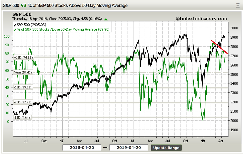
9. Bearish Breadth Divergence Again: This chart shows an example of bearish breadth divergence, where market breadth (percentage of S&P500 components tracking above their respective 50-day moving averages) has softened despite the headline index moving higher. The basic idea of bearish divergence is that is signals underlying weakness and narrowing of leadership.
Bearish divergences can and do resolve in a benign/positive manner from time to time, but they can also be powerful tools in identifying minor and major market tops. For what it's worth, you can also see bearish divergence in the average RSI of S&P500 stocks. So it's something to be mindful of.
Bottom line: Bearish breadth divergence detected on the 50dma breadth chart.
10. VIX and S&P500 Seasonality: Final chart of this week's session is the seasonality map for the S&P500 and the VIX (or CBOE Volatility Index). First, a quick note on method: the black line is the average daily price movement of the S&P500 (by business day), and the red line is the average level of the VIX by business day.
The first standout is how the two move inversely - which is entirely what you would expect. The second is that there is typically a positive seasonal tailwind around this time of the year (which I guess, among other things, helps put the strength we've seen into context).
But the other point to note is how this seasonal tailwind for higher stock prices and lower volatility tends to fade from around May (though, it only really gets negative from around Aug/Sep). While it is only one factor, and a minor one at that, it is something to think about as retail sentiment becomes increasingly bullish and bearish divergences show up.
Bottom line: The positive seasonal tailwind for stocks tends to fade from around late May.

So where does all this leave us?
This week there
1. Cyclicals and Green Shoots
On cyclicals and green shoots we saw how US cyclicals vs defensives seem to be close to driving a new "echo bull market" in stocks, and the strength in the US seems to also now be echoing across global equities, particularly in the last couple of weeks. This may be reflective of increasing signs of economic "green shoots".
2. Sentiment and Flows
On sentiment and flows we saw how "dumb money confidence" has reached a decade high (not always a good sign), yet Consensus bulls is on the skeptical side, and meanwhile foreigners have been dumping US equities (at least through Feb on a rolling 12m basis).
3. Warning Signs
On warning signs, you could say that valuations squaring up to neutral and a near term fading of seasonal tailwinds kind of fit into this category, but one thing that definitely does is the bearish breadth divergence signal that has been detected.
Summary
Tying it all together, the charts this week present quite an interesting mix, and almost a microcosm of some of the key issues playing out right now. On the one hand there are some promising signs out there (economic green shoots and strength in cyclicals), yet certain aspects of sentiment are becoming frothy, and some warning signs are starting to light up... certainly at least we can say valuations are not the same positive signal they were a couple of months ago. Personally I've noted a clear divide between bulls and bears, and the thing is they can't both be right given where the battle lines are drawn. So as for a possible "echo bull market"? I think we'll soon find out.
Follow us on:


Comments