
Weekly S&P 500 #ChartStorm - 15 June 2020
- Callum Thomas
- Jun 15, 2020
- 10 min read
Those that follow my personal account on Twitter will be familiar with my weekly S&P 500 #ChartStorm in which I pick out 10 charts on the S&P 500 to tweet. Typically I'll pick a couple of themes to explore with the charts, but sometimes it's just a selection of charts that will add to your perspective and help inform your own view - whether its bearish, bullish, or something else!
The purpose of this note is to add some extra context and color. It's worth noting that the aim of the #ChartStorm isn't necessarily to arrive at a certain view but to highlight charts and themes worth paying attention to. But inevitably if you keep an eye on the charts they tend to help tell the story, as you will see below.
So here's another S&P 500 #ChartStorm write-up!!
1. Equities vs. Fixed Income: Junk bonds say yay, Treasuries say nay. So let’s first talk stocks which are moving alongside junks bonds - the S&P 500 had an eventful week – failing at key resistance just above the 3200 area while finding support at the 200dma and prior range highs just above 2960. Volatility perked up last week, rallying from 24% Monday to 44% intraday Friday before settling at 36% - the highest weekly close since May 1.
For the S&P500 and (SPY), the weekly candle barely avoided a bearish engulfing pattern care of a late-session bounce from 2984 to the 3041 close. The S&P 500 and JNK are about where they were during late May despite a significant loss for the week – a strong rally (some may call it a melt-up) from May 14 to June 8 (+13% on SPX) left plenty of room for a pullback. While overhead supply is in the 3200-3400 range, there is now a respectable demand area from 2800-3000 from the April-May range.
Junk bonds have always been seen as having significantly more credit risk than interest rate risk, so their performance has been nearly lock-step with equities. Treasuries, meanwhile, fake out the market earlier this month with the 10-year yield popping above 90 basis points for a time before quickly settling back below 70 basis points. The Treasury bears are not quite ready to lift yields.
Bottom line: Pick your poison in bonds. If you are in the recovery camp, then junk bonds are your weapon of choice, but if you expect a rocky and volatile back half of the year, Treasuries may be the play. Bear in mind that yields are not bound at 0.00% as we have seen clearly in Europe.

2. "healthy correction" vs "next wave down". An update on that chart by @ThinkTankCharts from last week. The equity put-call ratio finally rebounded last week after falling to (and even beyond) bubblicious territory the prior week (which we also highlighted in the last writeup). A 5% pullback in stocks will do that. Still, the CPCE is still well into ‘Bubble’ territory as shown by ThinkTankCharts.
It begs the question – was last week the resumption of a downward trend in stocks? The CPCE is at similar levels to mid-February; a time when equities were still near their all-time highs before falling fast. Similar to the junk bonds vs. 10-year yield chart – this is another chart that asks what camp do you fall into?
Bottom line: The equity put-call ratio has been a popular one on the finance Twitter-sphere as of late. The statistic still suggests equities may have further to fall based on historical similar levels.

3. MACD Sell Signals. @bullmarketsco brings this look at the S&P 500 with the percent of components exhibiting MACD sell signals in the past 10 days. The figure hit near 40% - the highest since last fall. Just for some quick chart school (or a refresher course), the Moving Average Convergence/Divergence oscillator subtracts a longer-term moving average from a shorter-term moving average and turns the difference into an oscillator – so in effect you get a trend-following and momentum tool.
What is happening on this chart is the shorter-term moving average is moving away from the longer-term moving average on many individual stocks at the moment. @bullmarketsco notes that 38% of SPX stocks have triggered this sell signal, indicating that many individual names are rolling over on their respective charts. He sees a similar pattern among NASDAQ 100 components as well.
Bottom line: Big spikes in the number of S&P 500 stocks with MACD sell signals has spelled trouble for the market in recent years. It took just a few days for the jump to occur – the question is how long does the volatility go on? It can’t be just a few days, can it?

4. RSI displays many stocks hit “overbought” levels last week. How quickly things can change. The number of S&P 500 components that featured an RSI-14 above 70 was about 40 last for a time last week – that’s more than 5 standard deviations above the mean of around 7 stocks. Then it fell to zero by Friday’s close. Zero was a popular reading during late February through March during the sharp market decline, but then the near 50% rally over the course of less than 3 months yielded an astronomical number of individual names in decidedly ‘overbought’ territory.
It was actually a 5-year high in terms of the amount SPX components having an RSI-14 above 70 (43) at the peak last week. Recall early 2018 when the reading hit 5-signma – stocks fell hard, then entered a rather choppy trade for the next few months.
Bottom line: It’s easy for the market to fall quickly when so many components have gone straight up for a few weeks – there is just so little ‘congestion’ beneath prices on the charts to provide support – so one little hiccup can send the bulls scurrying for the exits. That’s pretty much what we saw on Thursday as equities trended down the whole session.

5. Fund flows declining as stocks churn. Investors apparently don’t want much to do with equity funds in the last two years as cumulative US equity fund flows have featured a negative slope since early 2018. There are a few things going on to take note of – (1) corporate buybacks have helped sustained equity market advances, (2) people are choosing to own individual stocks (e.g. the new wave of investors getting after it on platforms like Robinhood) and (3) Fed support is helping stocks head higher. So that sentence offered a little bit of everything to trigger everybody!
In all seriousness though, notice what happened in 2016 – we saw declining equity fund flows, then the S&P 500 chart eventually resolved higher. That can happen and may be the more likely outcome. From a sentiment point of view, when stocks simply churn for several months to a couple years, investors will naturally get uneasy with higher than usual volatility and little total return. That is what we have seen since early 2018 (despite the all-time highs that were common late last year and in early 2020).
Bottom line: Aggregated cumulative US equity fund flows continue to diverge vs the S&P 500. It was certainly a major juxtaposition in late 2019 and for the first few weeks of this year when stocks were melting-up as cumulative flows declined. This helps explain the rapid equity market downturn, even suggesting it was/is a healthy reset.

6. Investor Movement Index. TD Ameritrade has an interesting look at sentiment of retail investors. The tool is built off data from 11 million trading accounts – looking at holdings & positions and trading activity. When IMX goes up, it indicates retail investors are getting more bullish. The indicator follows a similar path to cumulative equity fund flows – the IMX has been in decline since late 2017 as the stock market has made all-time highs, yes, but has also featured periods of volatility and a massive & sharp 35% decline.
It’s important to note that outside of the S&P 500, there has been significant weakness and volatility (small caps, foreign stocks). May was the first month this year when the index managed to increase from the prior month. It would have been interesting to see what IMX hit at the highs last week in real-time as the melt-up lead stocks to overbought levels.
Bottom line: TD traders were net-buyers of stocks during May with the small amount of net bond purchases in over two years. What a cool sentiment stat this is. A nice 5% stock market shakeout on Thursday could have been just what the doctor ordered to wash some of the weak hands back out of the market (or into that warm blanket that is a low-duration bond fund).

7. Let’s climb out of the sandbox – what are the big players doing? While Ma & Pa traders (and all the Gen Z & Millennials with free trading apps and free time) were turning bullish in recent weeks, what has been going among North American institutional investors? It turns out they are not feeling so great about where we stand.
Investor confidence among ‘the smart money’ has been on the decline for the last 5 years, and below the key 100 neutral line since the middle part of 2018. It’s quite amazing to again see that all-time highs in late 2019 and early 2020 did little to excite investors. The SSICI is said to be influenced by what is happening economically as well, so weak data (maybe the weakest ever for Q2 2020) will obviously weigh heavily on sentiment readings.
Bottom line: While retail traders were getting amp’d up of late, institutional investors are casting a vote of no confidence on risky assets. There is also an election coming up soon, so it’s hard to see folks getting overly enthusiastic about holding equities for an extended period with significant political risk looming.

8. Allocations to stocks are low. JP Morgan provides this chart that displays equity allocations bouncing from the lowest level since early 2013. @CarlQuintanilla of CNBC noted that global equities would need a 47% price increase to match historical allocation levels. I’m not sure many analysts expect that kind of bounce from where we are today any time soon. This is yet another reading suggesting investors are rather glum about global stocks right now.
Perhaps the best combination for intermediate term pessimism is (1) terrible fundamentals and (2) a big recent stock market bounce. It just leaves investors feeling like there is another shoe to drop in both the economic situation (double-dip? W-shaped recovery?) and equities (dead-cat bounce? Relief rally?) Maybe it is indeed the ideal time for volatility to return and a choppy-trade to ensue – but does that mean a re-test of the lows in order? By now it seems most market participants are firmly staked in their respective camps.
Bottom line: The big (yuge) stock market rally of 2017 (post-election and in advance of the well-telegraphed tax cuts) marked the highest equity allocation among global investors since pre-financial crisis. Since then, we are talking more than two years by now, investors have been shedding stocks. Maybe this period is becoming increasingly reminiscent of the mid-2014 to early 2016 time frame when global equities struggled.

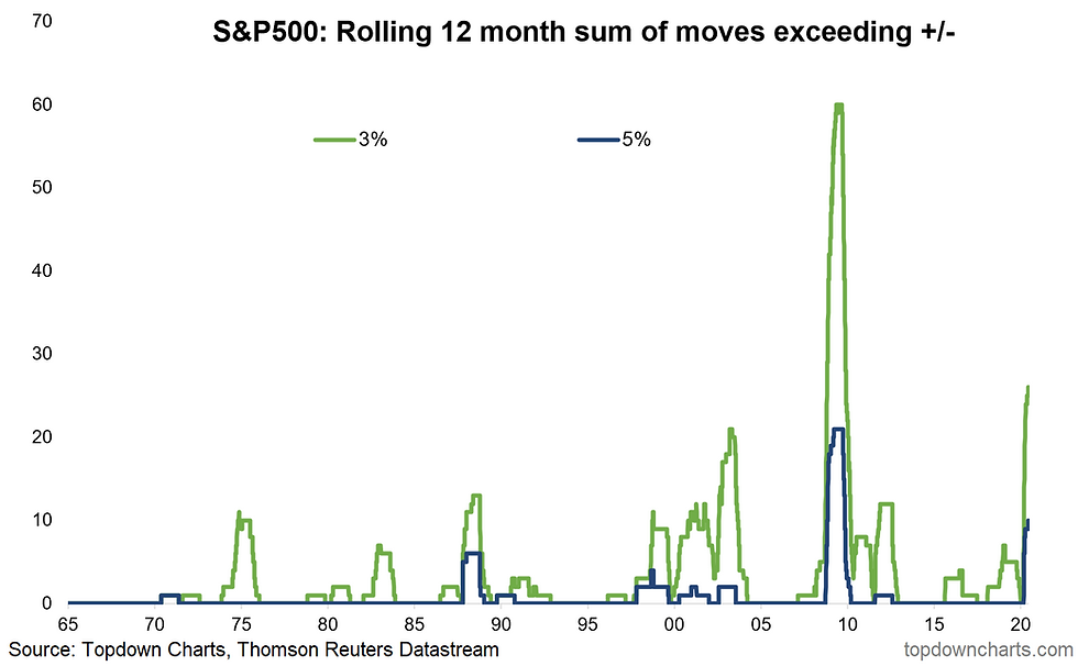
9. More 5% days ahead? The last four months have been among the most volatile ever. If the year ended today, 2020 would still be second to just the 2008-2009 time frame in terms of the number of 3% and 5% S&P 500 daily moves (since 1965). We added one to those counts this past Thursday, of course.
What’s interesting about the last four months is that the first half of the year is usually a quieter time for stocks – September & October are infamous for featuring volatility. Is that in the cards this year? It's hard to argue for anything but more volatility as the election approaches, a possible second wave of virus infections, simmering geopolitical risks, and so-on. Surely the narrative of negative seasonality will get some play on the major financial news programs as we approach autumn.
Bottom line: Nothing will chase long-term money out of the market like huge daily swings. People just don’t like seeing their nest-eggs fluctuation 5% in a day or 30% in a month. That is what 2020 has brought us. History suggest these periods don’t last very long, though above-average volatility is slow to retreat typically.
10. So are value stocks cheap or expensive? Inquiring minds.. @nosunkcosts shows us an interesting perspective of disagreement among equity analysts. Some say value stocks are cheap while a significant number of them think value equities are still expensive.
It’s easy to suggest either narrative right now considering how poor the economic/fundamental backdrop is for US value stocks (think restaurants, hotels), while also recognizing how poor value equities have performed in the last few years (is mean reversion finally on the way? Always a perilous question to pose).
Bottom line: There is historic disagreement among value analysts regarding if value stocks are cheap or expensive. We saw a similar spike during the Great Financial Crisis.

So where does all this leave us?
1. A return of volatility. A 5% drop last Thursday may have reversed some frothiness among traders. Countless stories emerged earlier this month regarding at-home day-traders making quick scores on speculative stocks – even bankrupt companies (such as Hertz - which even got inspired by the action to request permission to raise some equity capital!!). We were all waiting for a return of fear to shakeout those weak hands. Maybe last Thursday provided that jolt. But what does that mean for investors? Well of course the market cannot possibly keep up the pace of the last few months as the S&P 500 advanced nearly 50% from the March 23 low to the June peak. Volatility is bound to rear its head; 2020 is already tracking as one of the most volatile years on record.
2. Big money is not buoyed by the market’s bounce. Institutional investor sentiment remains subdued as cumulative equity flows have been on the decline for a couple years now. The weakest economic data points in history are understandably casting an ominous shadow for the smart money at the moment. An election a few short months away seems unlikely to change their outlook. The question is – what will it take to turn institutional and international investors from pessimistic to optimistic? And if/when that happens, how will equities respond? Will international stocks finally show signs of life? Will value stocks finally have their day in the sun? Ultimately either a turn in the data/news flow or simply just price dragging them along if the market were to attempt new highs.
3. Indicators & Intermarkets. Technicians love their indicators, and the number of S&P 500 stocks flashing bearish MACD signals really ticked higher last week. Meanwhile, the equity put-call ratio remains ominous for stock market bulls. Pragmatic investors must weigh the evidence and use these tools to develop an unbiased market outlook. Be flexible to new data – don’t dig your feet into a particular viewpoint (easier said than done!). We may be seeing that, however, across the fixed income space – junk bonds are of course trading along side equities right now while treasuries faked us out last week. Which camp is right? Hard to say (although I would lean bullish), but the better approach is to keep an eye on the technical readings while weighing fundamental/macro data, too.
Summary
Markets continue to walk a tight-rope, with gnashing of teeth on the faulty fundamentals falling on deaf ears of stimulus, bearish sentiment (contrarian bullish), and a hoard of new traders entering the market. The major open question is whether the late-week selloff is simply a healthy retest of the breakout or something more sinister. While we'd lean bullish given the solid technicals, somber sentiment, and wall of stimulus, it's difficult to get too excited about the upside from here given the looming risks. To pin me down I would say lean bullish, but don't be surprised if we end up with a volatile ranging market. Clearly from a risk management standpoint, a clean break below 3000 will probably open up further downside. And naturally, resilience of that level will be equally important on the bullish side.
See also: Weekly S&P500 #ChartStorm - 8 June 2020
Thanks to Mike Zaccardi, CFA, CMT, for his help in putting this together.
Follow us on:


Comments