
Weekly S&P 500 #ChartStorm - 10 June 2018
- Callum Thomas
- Jun 10, 2018
- 6 min read
Those that follow my personal account on Twitter will be familiar with my weekly S&P 500 #ChartStorm in which I pick out 10 charts on the S&P 500 to tweet. Typically I'll pick a couple of themes and hammer them home with the charts, but sometimes it's just a selection of charts that will add to your perspective and help inform your own view - whether its bearish, bullish, or something else!
The purpose of this note is to add some extra context beyond the 140 characters of Twitter. It's worth noting that the aim of the #ChartStorm isn't necessarily to arrive at a certain view but to highlight charts and themes worth paying attention to.
So here's the another S&P 500 #ChartStorm write-up!
1. Long Term Perspective on US Stockmarket Volatility: First up this week is a look at an alternative indicator of stock market volatility. It shows the rolling annual count of daily price changes exceeding +/- 1%. The key point on this one is that it has turned up sharply from a 50-year low. But as with the title of the chart, the open question is "now what?". Bulls will say it's just a repeat of 1997 where volatility went higher as stocks went higher. Bears will say it's an ominous parallel to 2007 where volatility turned sharply higher as stocks rolled over into a major bear market and subsequent crash and financial crisis. I would say we probably are in form more volatility as globally the monetary policy tides are turning (as the economic pulse is good).
Bottom line: This measure of volatility is turning higher from a 50-year low.

2. High yield credit vs the VIX: Staying with the topic of volatility, and moving in to the credit markets, the next chart shows that typically there tends to be a reasonably close link between equity implied volatility and high yield credit spreads. Overall across history equity market volatility tends to be more erratic, but what's really interesting is how credit spreads basically slept through all the market volatility of earlier this year. This is one reason I've erred on the bullish side short-term (i.e. the lack of spillover or broad bearish signals).
Bottom line: Credit spreads basically slept through the flareup in stock market volatility.

3. S&P500 vs High Yield Credit Spreads: Taking a slightly different angle, the next chart from Tiho Brkan of the Atlas Investor shows credit spreads against the level of the S&P500. You can see that credit spreads were rising into the 2015/16 corrections, and blew out materially. The reason is that there was very real fundamental drivers of those twin corrections (emerging market recessions, the commodity crunch)... and equally there was a fundamental reason for a rebound (big central bank easing by the ECB/BOJ/PBOC). So with credit spreads this well contained, it makes sense to postulate that the equity market correction has been mostly a sentiment issue.
Bottom line: In contrast to the 2015/16 corrections, credit spreads have been calm.

4. US vs Global Equities: If the previous two charts dealt with an apparent decoupling of credit and equities, the next one shows a giant decoupling between US and global equities. It stands in stark contrast to the late 80's and early 90's where global ex-US equities has somewhat of a golden age. And again, as with the first chart of this week's chart storm, it leaves an open question as to whether global equities ultimately catch-UP, or if US equities will ultimately catch-DOWN. From a valuation standpoint, just about every metric I look at points to compelling relative value in global ex-US equities, of course, valuation is only one factor.
Bottom line: US equities have decoupled from global equities ex-US.

5. Presidential Cycle: As we head towards the end of Q2 (yep, nearly half the year is gone!), it's worth keeping in mind this chart from Oppenheimer technicals which shows the long term average experience across the presidential cycle. Typically this quarter and the next are the worst performing stretch of the 4-year presidential cycle. It's worth keeping in mind that seasonality and cyclicality patterns can break down, an there can be a lot of dispersion around those average returns. However, at the margin it is something to be aware of.
Bottom line: The presidential cycle is historically at its most bearish right about now.

6. 50-day Moving Average Breadth: Staying with technicals, the 50-day moving average breadth chart shows a substantial improvement in market breadth from the oversold lows earlier this year. The fact that the market is recovering on more solid breadth is a good sign. The next step on this chart is going to be to monitor for signs of the market getting overbought, but we are certainly not there yet.
Bottom line: 50-day moving average breadth has improved substantially from the oversold lows.

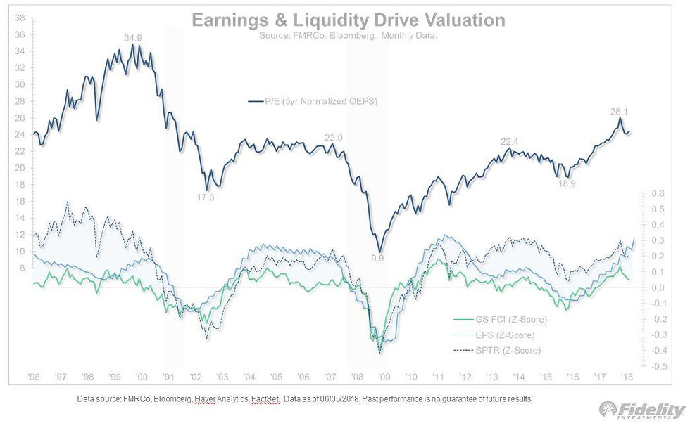
7. Earnings vs Financial Conditions: Moving back into the fundamentals, this interesting graph from Jurrien Timmer of Fidelity Investments shows the path of financial conditions, earnings, and S&P500 valuations. It's a really good way of capturing a key issue for the stock market right now: a situation of strongly improving earnings vs tightening financial conditions. At some point tightening financial conditions will have a dampening effect on earnings and stocks in general, but if the improvement in earnings can remain resilient, then you could see a snap higher in stocks.
Bottom line: There is a divergence between improving earnings and tightening financial conditions.
8. Asset Allocation - Cash: Speaking of financial conditions, and liquidity, and on this particular chart - cash... there has been a slight rebound in the AAII surveyed portfolio allocations to cash from the January lows, but overall cash allocations are at a cycle-low. Note - on both measures cash allocations are around 15%, this means there is very little cash on the sidelines, but in theory it could still go lower. Probably the big question for this one is at what point do Fed rate hikes start to make cash look like a more viable asset for earning income - rather than it's traditional function in a portfolio as a defensive asset or means of preservation of capital.
Bottom line: Investor portfolio allocations to cash are at a cycle low.

9. Tech Sector Weighting: I've previously remarked about how high a weighting technology takes in the S&P500, this interesting chart shared by Jeroen Blokland of Robeco Asset Management puts it into context. US market cap weighting to tech is certainly higher vs global (and especially Japan and Europe), but interestingly is below that of China (although I would note that the MSCI China index - being mostly offshore companies, has a much greater weighting to tech than the onshore or A-share market where financial services, industrials and materials take greater weight). Certainly food for thought as many aspects of tech look reminiscent of the late 1990's.
Bottom line: About a quarter of the US stock market is comprised of tech companies.

10. Capex Growth: Final chart of the week shows growth in capex (capital expenditure or business investment) across the major sectors and industries of the S&P500. It is a pretty important chart because if you think about it, companies don't invest in capacity or improving their business unless they see a good reason to (e.g. tight capacity, strong demand, expected good times ahead). The combination of the tax changes and the solid domestic economy make for a good mix for capex. So it leaves yet another open question of whether the USA is on the cusp of an investment boom...
Bottom line: S&P500 capex growth is turning up.

So where does all this leave us?
This week there's a wide range of charts but to put them in 3 catgories:
1. Bullish
In the bullish category there was improving market breadth, improving earnings, and the upturn in capex.
2. Bearish
In the bearish category there was the presidential cycle, tightening financial conditions, and low cash allocations.
3. Open questions
Some of the open questions included whether this is a 1997 or 2007 style upturn in volatility, whether US equities will catch-down or global equities will catch-up, and whether the US is on the cusp of an investment boom.
Summary
With such a diverse range of charts it's difficult to tie it all into a unified view on the market, but if I were to make an attempt at it, I would say that the big theme of this week is "open questions" with a variety of bullish, bearish, and other factors coming into play. The fact that the bullish looking charts are dealing with short term issues like improving market breadth, and medium term issues like improving earnings and capex, I would say are pretty important and carry a decent amount of weight. In fact you could even argue that tighter financial conditions and low cash allocations are simply par for the course at this stage of the cycle. So maybe then, the biggest open question is not whether it goes up or down, but how much upside is there left in this? For all the things to worry about, history is on the side of optimists and sometimes these things can go further than you expect.
See also: Weekly S&P500 #ChartStorm - 3 June 2018
Follow us on:


Comments