
Charts of 2021: Honorable Mentions
- Callum Thomas
- Jan 2, 2022
- 2 min read
Last week I shared with you some of my Best Charts of 2021 (as well as my Worst Charts of 2021 and then also my favorites!) -- so this week I wanted to follow up with what I would say are the "honorable mention" charts of 2021...
These charts were worthy of mention but didn’t quite fit into any of the previous categories -- but were definitely worth including and highlighting both due to how they proved useful in the past year or so, but also in terms of the outlook into 2022.
These charts were featured in my just-released 2021 End of Year Special Report -- check it out (free download as a holiday treat!).
Enjoy, feel free to share, and be sure to let me know what you think in the comments...
1. Expect Higher Taxes: This chart arguably points to higher tax rates ahead given that government debt as a % of GDP has doubled over the past decade while effectively economy-wide tax-take has gone sideways.

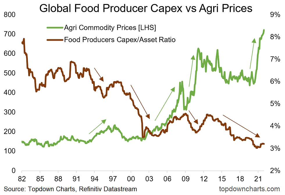
2. Global Food Crisis? Stagnant capex by food producers contributed to a perfect storm for food prices (along with actual storms, pandemic disruption, rising costs).
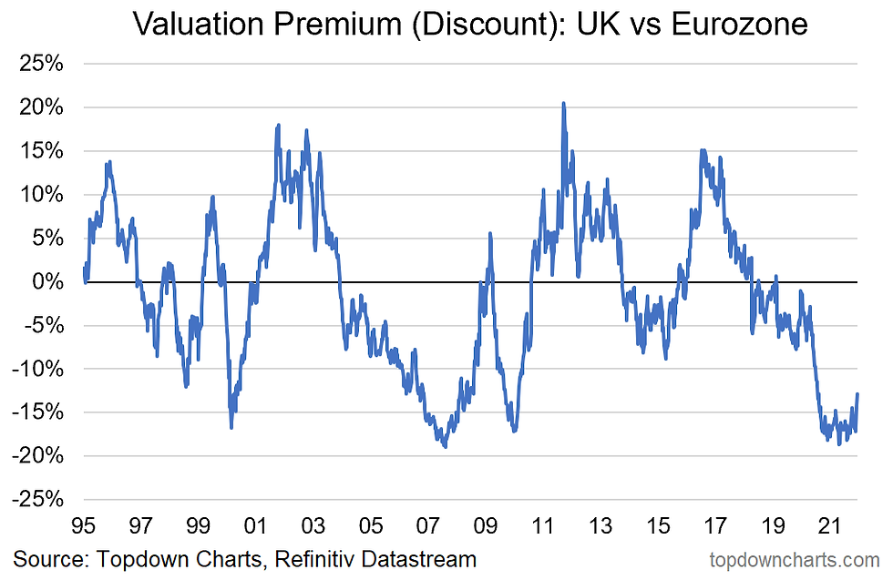
3. UK Equities: In the wake of Brexit & pandemic woes, UK equities moved to decade-low valuations vs their European peers. From crisis to opportunity?
>>> These charts were featured in our 2021 End of Year Special Report.
4. Global Shipping Capex: Shipping sector investment stagnated for a decade – contributing to the global supply chain chaos. Ironically it likely rebounds after banking windfall profits from the surge in freight rates.

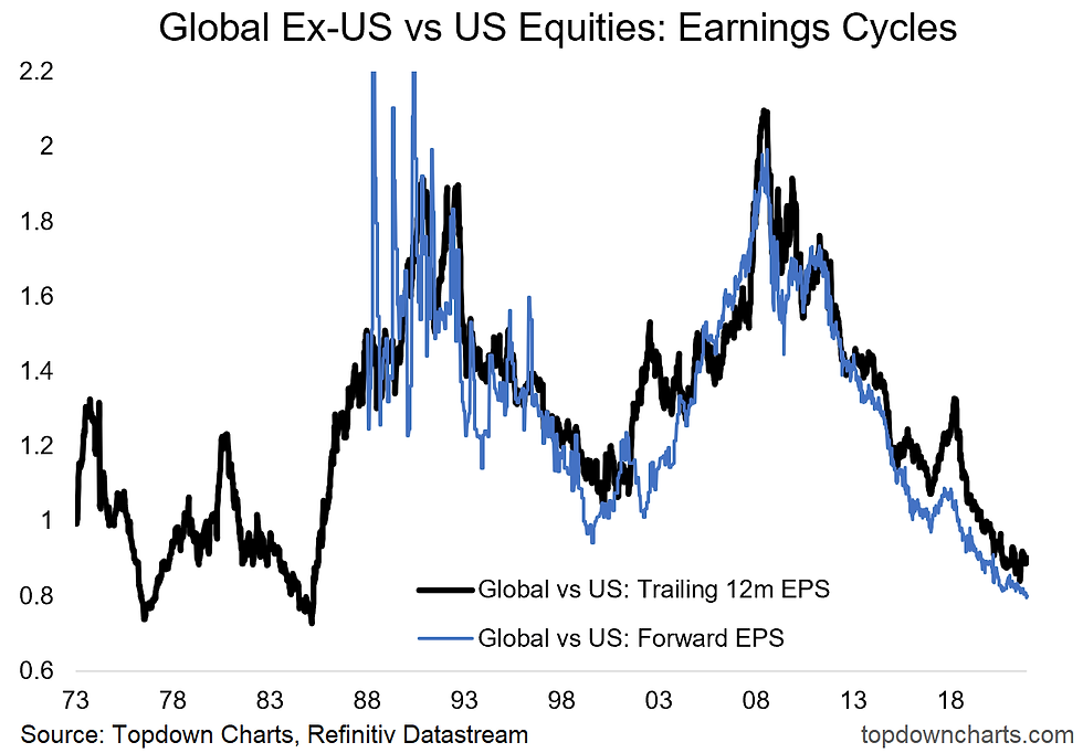
5. Global vs US Earnings Cycles: A key driver of the long-term cycles of relative price performance of global vs US equities has been the cycles in relative earnings. That cycle will need to change for the price cycle to change.
6. Pandemic Progress: the global rollout of vaccines, rising immunity, societal adaptations, and therapeutics have helped result in a series of lower highs in deaths – I like the look of that trend. The light at the end of the tunnel, though flickering at times, does seem a little brighter now…

Thanks for reading!
This is an excerpt from my 2021 End of Year Special report - click through to download a free copy of the report.
Best regards
Callum Thomas
Head of Research and Founder of Topdown Charts
Follow us on:
Substack https://topdowncharts.substack.com/


Mình thường xem qua phần thông tin và thống kê trước khi trải nghiệm một nền tảng giải trí trực tuyến. Khi đọc các số liệu được giới thiệu, mình thấy hệ thống nhắc đến lượng người tham gia và kho trò chơi khá đa dạng. Trong lúc tìm hiểu thêm về UY88 mình nhận thấy nội dung được sắp xếp khá hợp lý, giúp người xem dễ nắm bắt thông tin. Giao diện tổng thể trông gọn gàng và dễ nhìn. Cá nhân mình thấy cách trình bày tương đối rõ ràng và thuận tiện theo dõi.
Tôi thường ưu tiên các bài viết giới thiệu nền tảng giải trí được viết súc tích để tiện xem nhanh.
Phần nhắc đến trang chủ F168 được đặt ở giữa bài nên nội dung khá hợp lý.
Nền tảng được giới thiệu rõ ràng, thao tác mượt mà.
Tổng thể dễ đọc nên không tốn nhiều thời gian.
Lúc rảnh mình mở thử link F168 được gửi, chủ yếu xem qua cách trình bày. Cảm nhận chung là bố cục đơn giản, dễ nhìn. Với mình như vậy là đủ để tham khảo nhanh.
Mình thường ưu tiên những bài giới thiệu nền tảng giải trí có cách trình bày gọn gàng, đọc nhanh trên màn hình nhỏ mà vẫn nắm được ý chính. Với https://bongdalu.institute/, nội dung được triển khai khá cân đối, phần nhắc đến nền tảng nằm ở giữa bài nên mạch đọc tự nhiên, không bị nặng thông tin ngay từ đầu. Bài viết tập trung mô tả trải nghiệm tổng thể theo hướng đơn giản, dễ thao tác, kèm theo các dòng trò chơi quen thuộc để người xem dễ hình dung. Cách diễn đạt vừa phải, không lan man, tạo cảm giác nhẹ nhàng và mang tính tham khảo hơn là giới thiệu dồn dập.
Trong lúc lướt đọc bình luận ở một bài viết, mình thấy có người nhắc tới https://tg887.co.com/ nên cũng tò mò bấm vào xem thử. Thực ra mình chỉ xem nhanh để nhìn cách trang bố trí nội dung và giao diện tổng thể chứ chưa tìm hiểu chi tiết. Nhìn chung bố cục khá rõ ràng, các phần được phân chia hợp lý nên dễ theo dõi. Trang cũng không có quá nhiều chi tiết gây rối nên nhìn khá thoải mái. Mình xem một lúc ngắn rồi thoát ra để quay lại phần nội dung đang đọc dở.