
New Coverage Initiated in 2021
- Callum Thomas
- Jan 5, 2022
- 2 min read
A couple of weeks ago I shared with you some of my Best Charts of 2021 (as well as my Worst Charts of 2021 and then also my favorites! ...and of course the "Honorable Mentions" for the charts worthy of mention but not quite fitting into the other categories).
This week I wanted to follow up with a selection of charts from areas in which we expanded coverage this year. Coverage was expanded to these assets/markets for a variety of reasons e.g. client demand, filling gaps in coverage -- or logical growth/evolution of coverage, or even simply because something particularly interesting was going on in the space and we wanted to dig a little deeper.
It's a good insight into how we seek to be constantly innovating, and follows on from blog posts which covered the same in 2020 and 2019. I'm already excited to see what the 2022 version of this blog post ends up looking like (and as a hint I've already got a bunch of ideas on the research agenda... but as always am very open to suggestions from clients and subscribers!).
These charts were featured in my just-released 2021 End of Year Special Report -- check it out (free download as a holiday treat!).
Enjoy, and feel free to share! Also be sure to let me know what you think in the comments...
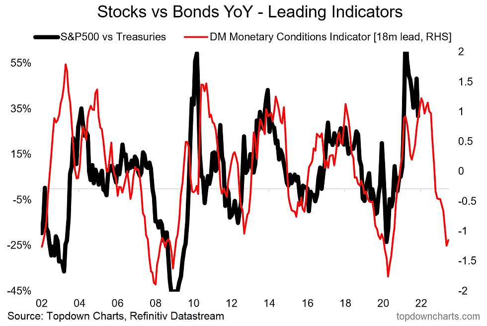
1. Stock/Bond Ratio: This exercise built-out some specific indicators for the stock/bond ratio, with very interesting conclusions. This chart in particular shows how tightening monetary conditions could lead to a decisively more challenging 2022/23.
2. Chinese Government Bonds: Coverage of this increasingly significant sub-asset class initiated at the request of clients. Currently they look somewhat expensive (like most government bonds! -- especially US treasuries).

3. Emerging Markets ex-China: Much like how we look at Global (or developed market) Equities excluding-USA – by popular demand, we built out indicators breaking EM down into EM ex-China. I think this will become increasingly important as China grows, but also as the drivers are different and there are clear cycles of relative performance as the chart below shows.

>>> These charts were featured in our 2021 End of Year Special Report.
4. Defensive Value: Significantly expanded the suite of indicators on what may end up being a very important corner of equities in the coming months and years. Also providing yet another echo of the dot-com boom with defensive equities looking very cheap on a relative basis -- the cheapest since 2000.

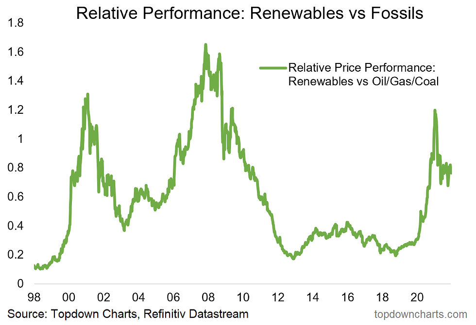
5. Clean Energy: Built out an initial set of indicators on the clean energy equities sector –also comparing renewables vs fossil fuels. What an explosive run this sector had (the rise and rise of ESG investing (and Tesla/EVs)).
6. Carbon: An intriguing asset class which bore many parallels to the frenzied price action across commodities and crypto/NFTs. Carbon is an important piece of the ESG/Zero-Carbon investing story as investor preferences (and politics) shift.

Thanks for reading!
This is an excerpt from my 2021 End of Year Special report - click through to download a free copy of the report.
Best regards
Callum Thomas
Head of Research and Founder of Topdown Charts
Follow us on:
Substack https://topdowncharts.substack.com/


Comments